
Graphics are the window through which system operators (facilities personnel) comprehend and view the associated systems. Looking through a small or smudged window affects how you perceive what you are viewing. Similarly, poorly implemented graphics affect how well the operator can understand and operate the connected devices. Graphics are frequently an afterthought and their low priority oftentimes results in poor implementation. Creating robust graphics for operators is a critical part of project design, construction and commissioning. Each of these groups has a significant role to play in providing a set of graphics that will serve the facility’s operators well.
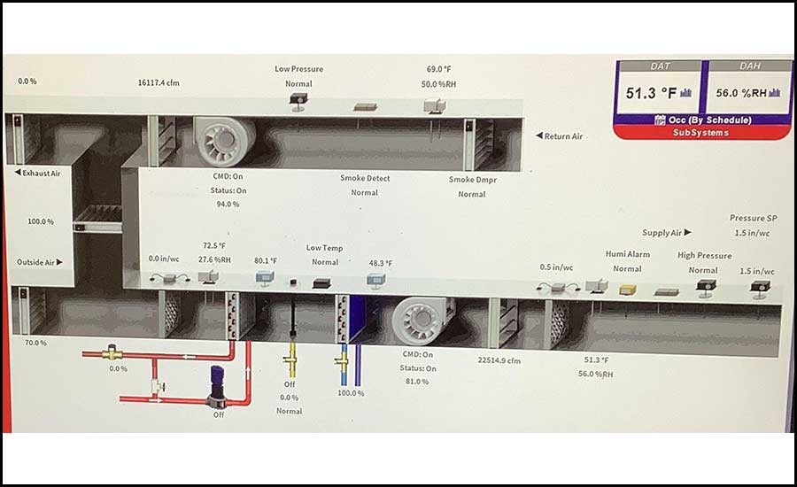
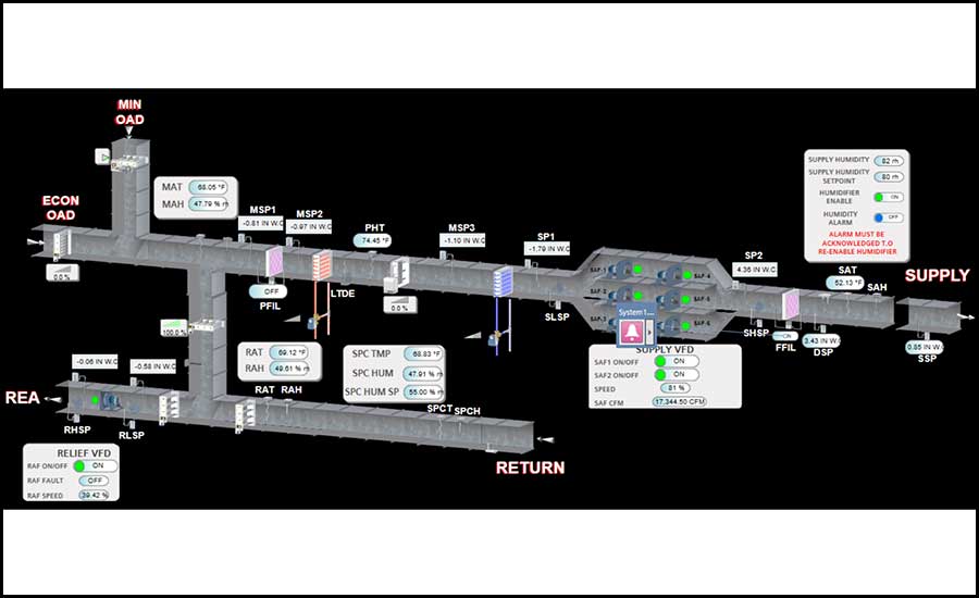
This article’s content is geared toward building automation system (BAS) graphics used in health care controls systems for custom MEP equipment, specifically HVAC. These thoughts are with summary equipment graphics in mind (see Figure 1 for an example), but some concepts also apply to floorplans and other graphics. Examples of commonly missed items are based on personal experience. Many of the observations noted below will not apply to packaged pieces of equipment. There is a brief section at the end for implementation of packaged controls.
ITEMS LACKING ON GRAPHICS
Newer generation control systems graphics are fun and sleek. They indicate equipment in motion, flowing water, and even glow blue or orange to indicate the relative temperature within equipment. However, most facilities personnel I interact with would rather have graphics from an older control system. They claim older systems were simple, easier to read, and gave them the core data they cared about without unnecessary functions getting in the way. Several complaints I hear about newer BAS graphics include: “It’s frustrating to navigate.”; “I don’t know how to find that.”; and even “I cannot read anything unless I find my glasses first.” Many operators do not care much for fancy graphics if desired information is not easily accessible.
It’s easy to write off these comments thinking facilities personnel never want to change or just a little more owner training is needed. Yet, there is helpful truth behind these comments. When reviewing system graphics during commissioning, I find newer BAS graphics navigation is not always intuitive and critical system information is frequently missing.
How can we as an industry better serve and equip the operators who will care for this equipment for years to come? Individual experience will vary based on the controls company and their team developing the graphics. Yet, there is some consistency in the problems identified with graphics. Below are typical concerns I find during commissioning reviews and when discussing graphics with the facilities personnel.
Readability
Current operators are using desktops, laptops, tablets and even phones for viewing. While readability is a hard item to define, graphics that are difficult to read cannot effectively communicate information. Default text should be large enough to read on a typical computer screen without using zoom, navigation around a graphic should be easy, and menu access must be intuitive. There are many challenges to making graphics accessible to all users, but readability and good user interface is of utmost importance.
Hard Points
I use the term “hard” points to refer to all control inputs, outputs, etc., that are associated with a real, physical object. Think of a temperature sensor or a valve actuator. Of the graphics concerns, hard points generally have the fewest problems since these are the devices we specify and install. But it is a good reminder to ensure all hard points and alarms associated to them are clearly shown on the graphic with the correct icon and placed in the same orientation as the physical installation. Information should be collected neatly to help the operator. Consider adding separate tables that hold all of the temperatures, static pressures or valve and damper positions to give operators a quick summary of current conditions.
Soft Points
“Soft” points refers to all data, values and signals that are not pulled from or sent to a physical device. This includes set points, range limits for resets, values calculated from other real sensors (think calculating enthalpy from temperature and humidity sensor readings), special operating modes, etc. These points are commonly left off equipment summary graphics. Even though soft points are not tied to physical devices, they are crucial for an operator to access so they can understand what the system is doing.
For instance, many systems that are controlling to a minimum outside air cfm do not display the flow set point on the graphic. Operators have no idea if the measured cfm is near the set point. Some other useful items that are left off include upper/lower limits for fan static pressure and temperature reset limits; feedback on fan speed, damper positions, and valve positions; and current operating modes, like economizer, smoke removal, etc.
Sequence Graphics, Tooltips, and Other Contextual Information
Including context for logic behind a piece of equipment can provide significant value to operators. However, I’ve only seen this implemented on rare occasions. I wish it was more common. There are a couple of ways you can accomplish this: providing the full sequence logic on a separate graphics page or providing tooltips for select components on the equipment graphic.
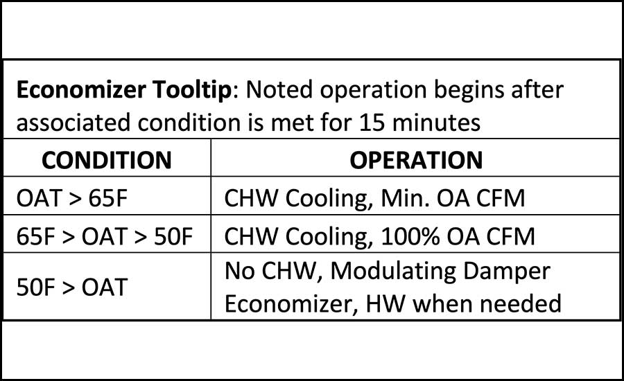
The full sequence method creates a graphics page with a copy of the sequence logic in narrative form and inserts the current value of that variable next to each variable noted in the sequence. When reading the current chilled water supply temperature point name “CHWS-TEMP,” you would see the live value 42.2°F embedded next to it in the sequence. Providing the whole sequence on screen allows the operators to understand the big picture and understand how specific devices interact with other components. Alternatively, tooltips are simpler and less daunting. This is accomplished by providing a small text box or pop-up note that briefly explains a piece of logic. An example could be economizer logic, like noted in Figure 2. These bridge the gap between the design intent and the operator who may not be privy to the “why” behind a design. Tooltips are not needed for everything, but I have seen great value for operators when they are used judiciously.
Lastly, providing ambient conditions on screen helps operators comprehend all system influences. Whether by sensors located at the facility or via regional weather stations, I would recommend all systems that are affected by outside ambient conditions have these conditions noted on each equipment’s summary graphic.
Alarms
Placing proper alarming onto a graphic is important. Alarms should grab the operator’s attention easily and quickly identify the issue. Pop-ups, color changes, etc., go a long way in accomplishing this. Keep in mind that alarms can be embedded in hard points, embedded in soft points, or created as separate points. This may alter how the alarm annunciates on the graphic. Annunciation on the equipment graphic should be in addition to a separate alarm log showing timestamps of active and cleared alarms for the whole system.
Other Challenges for Current Day Graphics
Construction schedules are tight. With current supply chain and labor issues, there is oftentimes a rush to complete and turn over a project at the end. Graphics are one of the final components to be installed in controlled systems. This frequently results in rushing the graphics implementation and quality checks are skipped. Additionally, several major control companies have third parties or separate divisions develop their project specific graphics. Creating or changing graphics can easily take weeks or even months. This only exacerbates schedule issues as a project nears turnover. Consider taking steps to start the graphics development earlier in a project and review the project specific graphics before implementation.
WHAT MAKES A GRAPHIC GOOD?
The quality of equipment graphics will skew how operators perceive that piece of equipment and the parties responsible for its design and construction. Good graphics improve the perception of the system and vice versa for graphics that are lacking. It is in everyone’s best interest to produce quality graphics. In short, a good equipment graphic has the following qualities:
1. It accurately depicts the equipment it represents.
2. It is easily read and understood.
- a. Text is easy to read and naming is intuitive.
- b. Logic tooltips are included to guide operators.
- c. Information is collected neatly (maybe into tables) so the graphic is not cluttered with points.
3. All hard points, soft points, and other information needed to monitor and assess automated equipment operation is provided on the graphic without significant lag or delays.
4. It provides the ability to override and manually control equipment if necessary.
5. It notifies and highlights items truly requiring attention.
- a. Overrides are obvious so equipment is not left in “hand”.
- b. Alarms are obvious and context for how to address the alarm is provided.
- c. Nuisance/false alarms are minimized — this is more a function of how you set alarm values and delays.
6. It provides access to both a separate alarm log and historical data trends.
While this does not directly improve the long term effect of a graphic, it is worth adding this:
7. It is implemented on schedule and is fully operational for owner training and turnover.
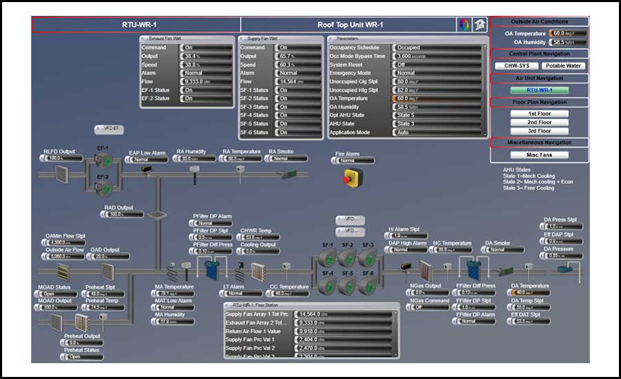
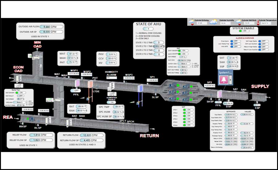
Consider the differences between Figure 1 and 3 and between Figure 5 and 6. The earlier figure in both sets has limited information and does not provide all of the information that an operator would need to effectively operate the equipment. The second figure in each set shows additional soft points and extra information that aids the operator.
ROLES IN COORDINATING GRAPHICS
How can a project team better develop and implement their graphics to make a project more successful? All parties have valuable roles to play.
Owners and Operators
It is not uncommon to find the “it is what it is” mentality among owners and operators when it comes to graphics. I encourage them to see there is opportunity to influence and direct items early in the project so the final product is aligned with expectations. This guidance usually includes providing initial direction and checking on the implementation at key checkpoints. Setting direction early and providing feedback throughout development will result in a better final product.
Recommendations
- At the beginning of a project, provide standards or an owner’s project requirements (OPR) with clear direction and examples of what is desired for equipment graphics.
- Review the controls contractor’s intent and graphics implementation through a controls kickoff meeting and graphics shop drawing reviews.
- Provide a final review of project graphics during commissioning or just prior to turnover.
Design Team
Engineers provide the direction for graphic creation through project specifications and drawings. These requirements are frequently sound when considering devices and the associated hard points. However, many project documents only provide generic direction in the specifications for creating custom equipment graphics. Projects can benefit from having more tailored requirements for custom equipment and plant graphics listed on the control drawings. Understand that many control contractors use the engineer’s control diagram on drawings as a template for how to build their graphic.
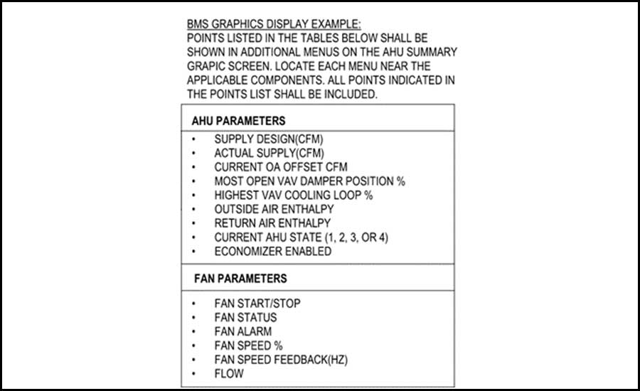
I encourage other engineers to take an active role in developing the graphic layout, providing direction on soft points and desired tooltips. After designing the equipment’s physical devices and operating logic, consider adding a list of soft points that need to be displayed on the graphic so an operator is well equipped. This could be displayed on the points list or noted in a list near the control diagram. Below is an example from a recent project.
In addition to these requirements, design teams can bring value through submittal review of the actual project graphics to make sure the contractor’s graphics comply with the design intent before installation. I see this review omitted from many projects and graphics are left to be decided on by the installer without an engineer’s review.
Recommendations
- Collect input from the owner or operator to understand what they value on a graphic and place these requirements on your control drawings.
- Do not rely on a boilerplate specification to cover all graphics requirements. List equipment-specific needs directly on the controls diagram or points list.
- Require a graphics submittal review of project-specific graphics for major pieces of equipment and plants.
- Review the graphics implementation during construction administration jobsite walks.
Construction Team
Graphics can be hard to pin down and control in a construction schedule. Accurately scheduling the graphics process is an important piece of being successful with the implementation. Understand the schedule impact when graphics revisions are requested and build a schedule that allows several revisions for major and custom graphics. Encourage communication between the parties that interact with the graphics through kickoffs, submittal reviews, etc.
Recommendations
- Make time for a roundtable discussion early in construction between the operator, engineer and controls contractor so graphics intent can be discussed. Set a plan for team review of the graphics.
- Require controls contractors to provide a project specific set of graphics that are submitted to the engineer and owner/operator for input prior to implementation.
- Include schedule time for several resubmittals and 4-6 weeks (confirm with the controls contractor) between submissions for third-party revisions.
- Include time in the schedule for correcting graphics issues identified in commissioning.
Commissioning
Commissioning should be performed on systems in their final state (just like how the operator will see and interact with the equipment). This means graphics must be complete to perform final commissioning. Good commissioning checklists and tests will include a review of the graphics and the associated alarms and trending logs for each piece of tested equipment. When verifying owner training, commissioning should verify graphic-specific training is included for all operator shifts. See Figures 5 and 6 depicting the impact commissioning had on this equipment graphic.
Between Figures 5 and 6, several tables were provided to show soft points and alarms. Small tooltips were added to explain operating modes for the AHU, VFD HOA positions, and various flow station uses.
PACKAGED SYSTEM GRAPHICS
The bulk of this article is written for custom equipment graphics, but it is worth making note of packaged system graphics, such as a direct-expansion rooftop unit. Packaged systems pulled into a BAS are limited on their customization. Outside of monitoring the equipment’s points and controlling a handful of set points, options are limited. That is okay.
Bear in mind that packaged systems differ from custom systems and you will be limited on your graphics. I recommend engineers list on control sheets all of the points desired for monitoring and the desired set points to control. Unfortunately, I see many engineers require controls to “monitor and control all available points” frequently. Be wary of requiring this. A packaged system may have hundreds of points, like refrigerant suction pressure, superheat, etc. There are a lot of points that could be pulled to the graphic. It’s possible the operator wants these on the graphic. However, most facilities do not. The blanket statement to monitor all points would be improved by only specifically requiring the approximately 10 to 20 points that need to be included on the graphic for operator use. Review intent with the project team and end user so only desired points are called for on the graphic.
CLOSING
In order to better support building operators, consider ways that you can take a more active role and add value to the final project graphics. Graphics are frequently left as one of the final items to implement and minimal direction and oversight is provided on custom equipment graphic appearances and content. Consider adding job-specific graphics requirements to the controls drawings, track graphics development and submittals on a project schedule, and make a final QC review of the graphics with the operator involved. Just like a small or obscured window is limited on its value to view through, a graphic loses value when it does provide a complete view of the equipment it controls and represents.
Thank you to my colleague Zach Davis for assistance with reviewing this article.


")
