
One of the best ways to correlate two variables (such as power use and temperature) that both vary over time is to chart them using a secondary Y-axis. Anyone with Excel 2000 (or later) can do it.
The Trick: First Do It Wrong
Start by setting up an Excel worksheet having three rows:
- Row 1 has the time increments you wish to chart (e.g., hours);
- Row 2 is your first variable (e.g., kW); and
- Row 3 is your second variable (e.g., temperature).
But where's the second Y-axis that shows temperature? Now comes the magic.
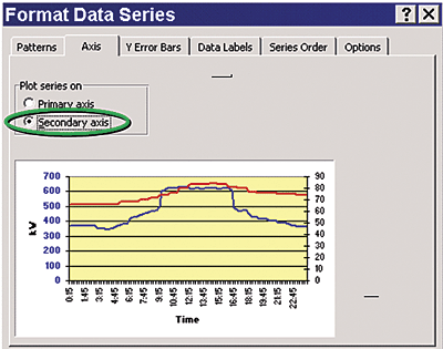
Format The Data Series
Right click on the lower curve to see a list of options that starts with "Format Data Series..." Choose that phrase, and see a dialog box appear entitled "Format Data Series" (see figure 2). Click on the "Axes" tab and see a pair of radio buttons and the words "Plot series on:" Choose "secondary axis." See the thumbnail chart change as the temperature curve moves up and a right side Y-axis appears showing a range of temperatures. Click "OK."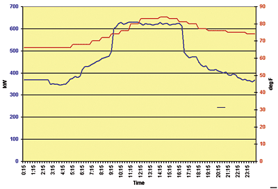
How Have Such Charts Been Used?
The resulting graph (figure 3) shows how electric demand and temperature vary with time. The bump in kW was caused by starting up and running an extra chiller for eight hours, even though outside temperature rose only slightly. An inexperienced operator had turned on the unit "just to be on the safe side," costing the firm thousands of dollars in extra demand charges.
By examining chiller operations (and comparable kW/temperature load profiles) on hotter days, a better chiller dispatching process was developed to guide plant operators as to when an extra chiller might be needed, based on shifting hourly outdoor air temperature. ES
EDITOR'S NOTE:
To view all of the images associated with this column more clearly, please refer to the print vesion of ES.


