Putting Interval Data To Work For You
Most commercial/industrial electric accounts of 1 MW or higher are billed using an interval meter that reads usage in 15- or 30-min increments and reports that data (typically through a phone line) back to a utility computer. The customer is charged for peak demand based on the highest consumption seen in one or two consecutive increments. A 300-kWh usage over 15 min, for example, would translate into a 1,200-kW demand for that period. Smart customers feed such information into a building management system (BMS), or get the data in electronic format for later analysis (e.g., to find controls failures).Virtual Landscaping
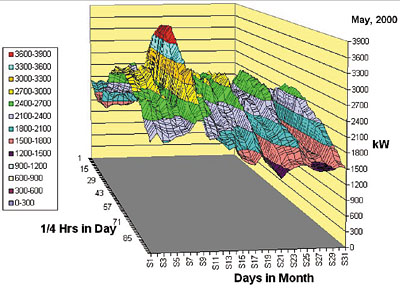
Using Excel's chart features, the 3,000 monthly data points from an interval meter transform a typical building's power usage into a series of parallel weekday mountains, each 24 hrs long, separated by weekend valleys. If nighttime usage is the same on weekdays and weekends, a plateau is visible at each end of the mountain range. A sharp peak means a short jump in demand and (probably) a hefty peak demand charge.Making the Magic Happen
To create these charts, you need interval meter data (preferably in 1/4-hr periods for a month), a 400-MHz Pentium II PC (or better), and Excel. When developing a shape for an entire year, use at least a 700-MHz Pentium III machine to avoid the long regeneration times required each time a change is made (e.g., orientation, title).To make the chart come out right, here are a few tips:
- Start with a full row of data. Empty spaces in the first row confuse Excel. If such is the case, delete cells until you have a starting row that is completely filled. Highlight only the data cells, not the times, dates, or other information that may be provided in the file.
- Use Excel's Chart Wizard to create the initial version of your graph. At its Step 1 (chart type), choose "surface." Under "chart sub-type" on that same screen, choose "3-D surface."
- Title the axes as follows: "1/4 hours of a day" for the X-axis, "days" for the Y-axis, and "kW?4" for the Z-axis. Since interval data is actually given in kWh per 1/4 hr, the demand readings on the graph will be 1/4 of the average demands seen in each interval. Your IT people can help you make that correction. Since that fix does not alter the shape of the surface, it's easier at this point to just remember to multiply any demand numbers by 4 to find their true values.
Once your chart is completed, the numbers for the days will appear with the letter "S" in front of them (e.g., S1, S7). That is an artifact of Excel; don't worry about it.
If you don't have a month of interval data to play with, e-mail us at Energywiz and we'll send you the above figure (in Excel 2000 format).
Soaring Across Your Data
On your toolbar, click on the chart tool to see a drop-down box. Click on 3-D View to see fields for Elevation, Rotation, Perspective, and Height. First, stretch the days' axis by reducing the height percentage to 50; click on "apply." Click on the various arrows in the box to maneuver the wire frame sketch. When it's oriented the way you want to view your 3-D surface, click on "apply" to see the chart move into that orientation.Above you'll see a two-day period where the power demand is significantly higher due to unseasonal temperatures. The chillers had to run full tilt for just two days, raising the peak demand from the next highest point (3,036 kW) to 3,900 kW. A hybrid chiller plant (i.e., employing both electric and gas-fired chillers) or a thermal storage system might have avoided that costly bump. ES


